Learn from the Best
The Best in Blogging series gives you proven strategies from top industry experts.
We’ve shared a lot of information on this site about making your food blog more interactive, from offering ebooks and video tutorials to creating fun quizzes and digital workbooks. But perhaps one of the simplest ways to create a space that feels like a personal, dynamic experience for your followers are the ones you already use: your words and your design.
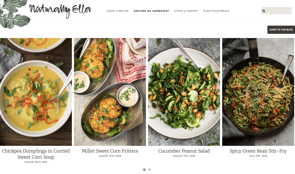
I was looking over Greatist’s list of 32 Must-Follow Food and Nutrition Blogs, and Erin Alderson’s vegetarian-focused food blog Naturally Ella was number one on the list. It’s no wonder, either. The site is simple and elegant with beautiful photography and delicious recipes.
But what really struck me was the way her design and her use of language encourage a sense of exploration and activity.
Take a look at the navigation titles first
Rather than simply listing her major pages, she makes each navigation title an action. She’s not just telling you what’s on the site, she’s motivating you to do something with the content that you find there. It’s a small detail, but an exciting and unique one. And through that word choice, she’s made her site feel more like a playground or classroom – an interactive space – than a mere dropbox for recipes.
Scroll down a little farther on the home page
The navigation title Explore An Ingredient shows up again as a visual mini-index. If you go to the actual page, you’ll find even more ingredients categorized alphabetically.
First, note Erin’s spare imagery. It’s focused on the individual ingredient, and it’s stunning in its simplicity. Don’t those photos make you want to start cooking right away? And isn’t it a cool idea to actually take real estate away from recipes and give delicious ingredients their own space in the spotlight?
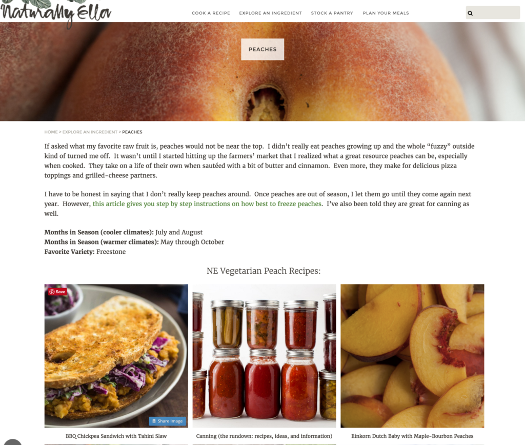
Again, starting this section with the action verb explore has primed me to start engaging with the content. Paired with the picture, my curiosity is piqued. I’d love to know a little more about peaches. What will I find if I dig into Naturally Ella’s ingredients?
Click on an ingredient to learn more
You bet I will, and I don’t regret it! Erin takes time to provide useful information on each ingredient, including links to more information, simplified data on each ingredient’s season and varietals, and lots of recipes that incorporate the ingredient!
This layout definitely took some extra work, but it pays off. She’s got me down the peach rabbit hole and ready to try out every single recipe pronto! Plus, it’s such a neat idea, I really want to just take time to learn about all the other ingredients. And don’t get me started on her Stock A Pantry section.
Oh, c’mon, let’s check out the pantry, too
I can’t help myself at this point. Erin’s intuitive navigation and enticing words and images has me hooked. So here’s what Stock A Pantry looks like on the home page.
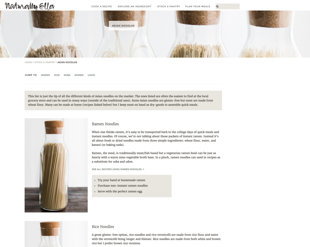
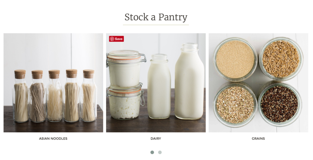 And when you select a pantry ingredient, you’re taken to a page that gives you plenty more to think about.
Erin offers insights on a wide variety of, in this case, Asian noodles, but she also does a little bit more. She offers some suggestions on how to further your learning through simple activities. Note the action verbs at the beginning of each suggestion. She’s prepping you to do something again.
How can you tweak your site to encourage more active engagement?
Use Erin’s site as a model. She’s proof that sometimes engagement is in the simple things: the way that you encourage your users to navigate your site and take actions when they leave it!
How are you encouraging your followers to get engaged with your food blog’s content?


Leave a Reply