Learn from the Best
The Best in Blogging series gives you proven strategies from top industry experts.
A great chef isn’t satisfied with merely tasty morsels. She also wants each dish to be a treat to the eyes. That’s why fine dining restaurants take such great pains to prepare spreads that look almost too good to eat.
A white plate gives bright veggies center stage. An artful dash of sauce or freshly chopped herbs or lemon zest adds visual contrast. A beautiful meal, quite simply, tastes better.
Likewise, for your food blog to stand out from greasy spoon affairs, you’ve got to take time to consider presentation. These three elements are absolutely essential to creating a food blog that looks as good as your recipes taste.
Consistent Themes
Just as a busy china pattern can detract from the natural beauty of a colorful salad, a busy website can distract readers from your recipes. In most cases, following the Rule of Three is the best way to keep your site looking consistent – limit yourself to three brand colors and three brand fonts.
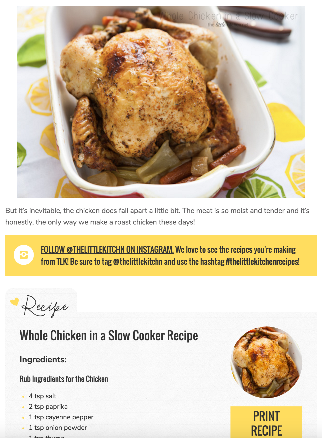
The Little Kitchen color scheme includes a clean, white foundation accented with modern charcoal and vibrant yellow. The white space keeps the site looking fresh and airy, and the yellow draws a cheerful spotlight onto important recipe features. The site’s font pairing includes the complementary Nunito and Oswalt typefaces accented by a playful cursive to highlight major sections. Notice how the consistent use of these elements – even in the photographs – brings the site together beautifully.
Pleasing Food Photography
Photography is another critical element of your food blog’s presentation. Incorporate your brand colors as seen in The Little Kitchen photo above, and don’t shy away from including your food blog’s name on images that you want shared on social media.
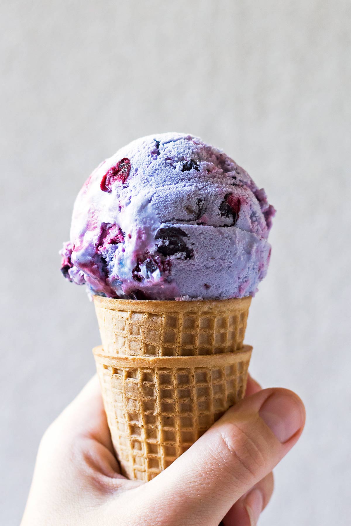
Regina of Leelalicious generously dedicated a section of her food blog to offer her readers insights on building food photography skills. It only takes a quick tour of her blog to recognize the power of artistically styled photos.
Novel Navigation
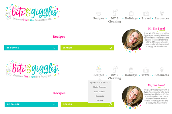
Don’t forget your food blog’s navigation when you’re considering design elements. While your navigation should be intuitive, it doesn’t have to be boring. Bitz and Giggles includes a surprising interactive element that makes searching the site fun and easy. This little burst of color adds excitement to the homepage, and it’s perfectly in keeping with the festive decor of the site.
Even the savviest food bloggers may need help taking their site from a good meal to a sensation for the senses. If you’re not sure where to begin, consult with the pros at Once Coupled. We’ve helped dozens of the web’s most innovative food bloggers take their design and development to the next level.
What web design elements do you want to improve on your food blog?


Leave a Reply