Jessica came to me with a laundry list of changes, knowing exactly how she wanted her readers to feel when they were on her site, if not exactly how to accomplish that. We sent a number of emails back and forth to establish a starting point, then got to work and made changes as they came up.
Website Clean-up
The first step with Jess’s site was to clean it up – not just the pretty face of the page, but the WordPress installation underneath it, running everything. Everything was updated, unnecessary plugins deleted, and security plugins added. We needed to optimize the site for speed and safety.
Mobile Optimized Header
One of Jess’s pet peeves is not being able to find the social media icons or search bar on a website she’s visiting – not just on desktop, but on mobile. To make sure that both of these were at the top of the page on either platform, we placed them in the header rather than the sidebar (which would register toward the bottom of the page on smaller screens). We also separated her menu into two sections and placed a newsletter subscription box at the top of her page, where it would be unobtrusive.
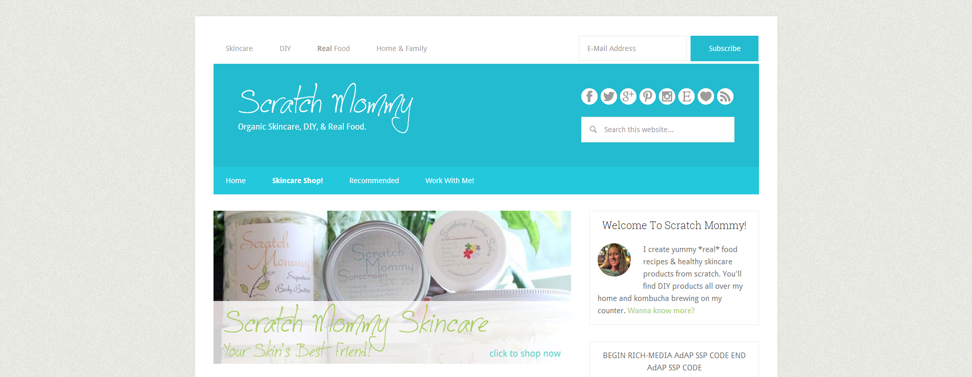
Home Page Information
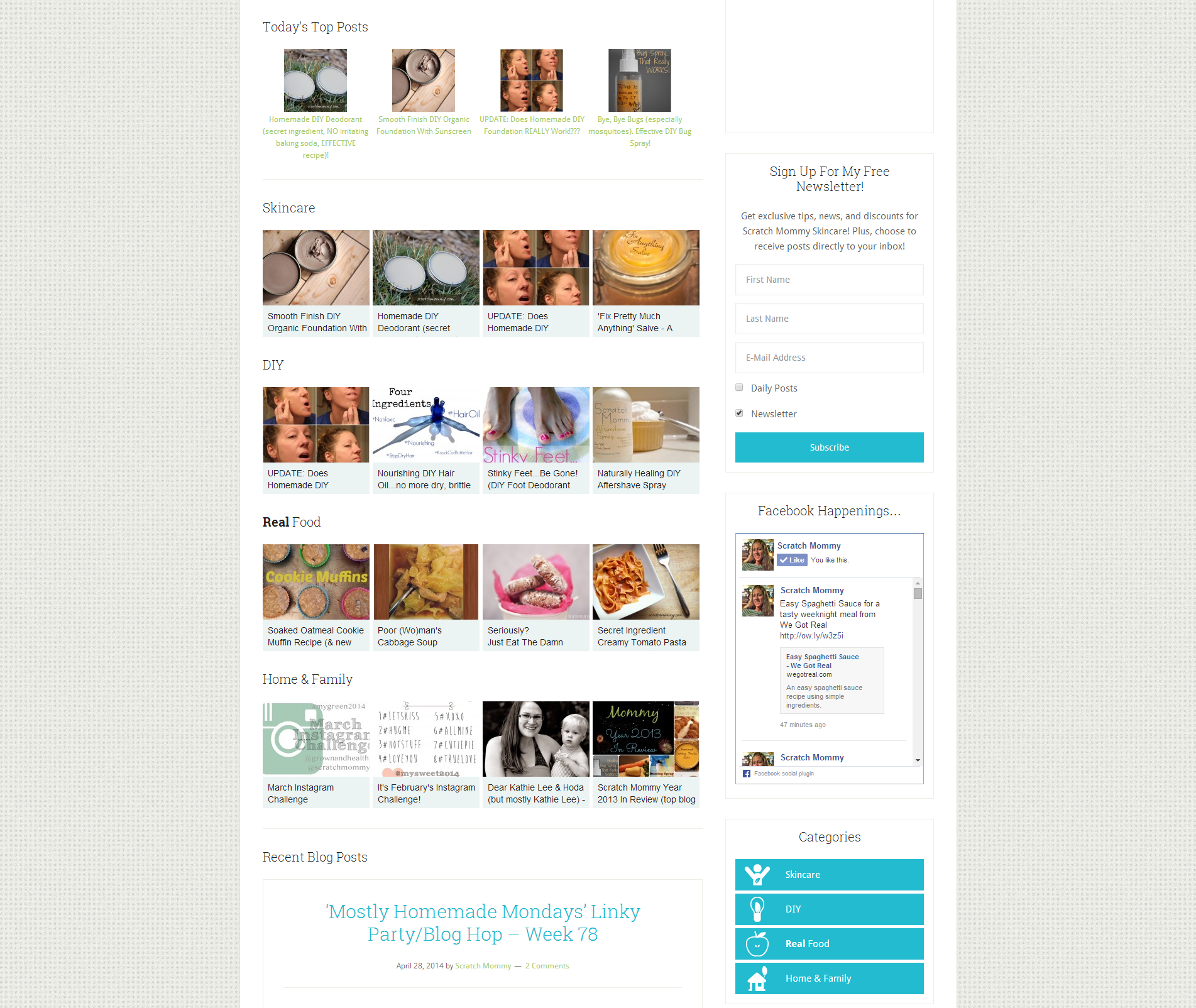
Jess wanted all the information on her site to be easily accessible, rather than just her latest blog posts. We needed the very top to be a call to action “click to show now” to support her business, but after that area we added two sections: popular posts read by others and category carousels to browse her content. After these sections, her latest blog posts could be found.
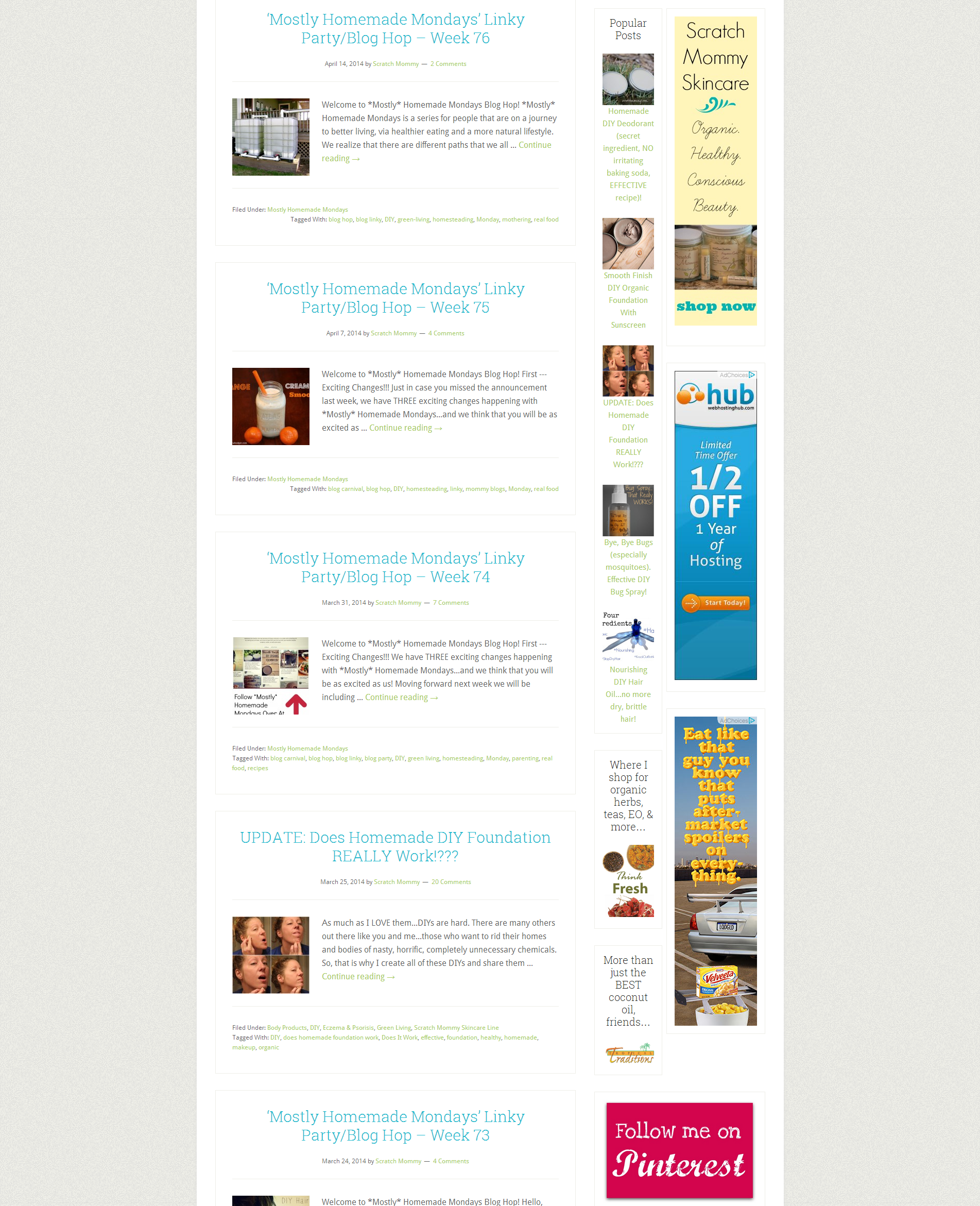
Side-by-side sidebars
Ads sized 160 x 600 are pretty popular, despite the fact that they never seem to “fit” anywhere, huh? Well, in a sidebar you can be creative and place content next to the ads. This retains the sidebars integrity and allows you to integrate your advertisements in a non-invasive manner.
MailChimp RSS Newsletter
Jess already had a MailChimp list, but she wanted her readers to be able to receive her posts straight to their inbox. To accomplish this, we set up a preference group for those subscribers, added a sign-up box for this preference group, and created a RSS-driven campaign that targeted that list segment.