Gayle came to Once Coupled while working with a separate designer, Melissa Rose Design. After receiving the final .AI file from Gayle’s designer, Once Coupled set to creating a pixel-perfect layout for the Pumpkin N Spice blog. Gayle’s site is completely mobile-first design.
Beautiful Desktop Menu
A gorgeous introduction to the site, visitors are greeted with fun icons and detailed drop-downs to navigate the Pumpkin N Spice content.

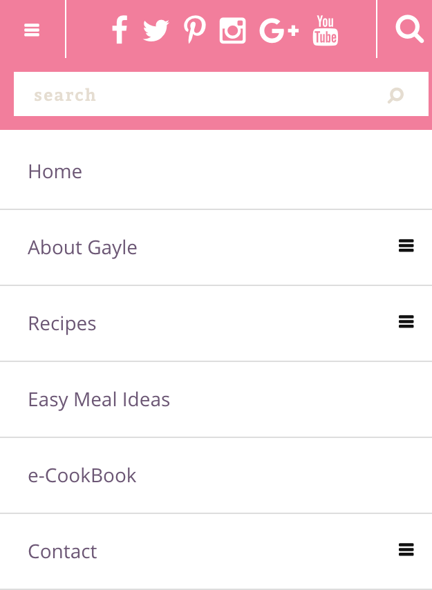
Equally beautiful mobile menu
Mobile visitors are no exception. Gayle’s mobile menu combines all of the information from her desktop site into a compact, easy-to-use top-bar.

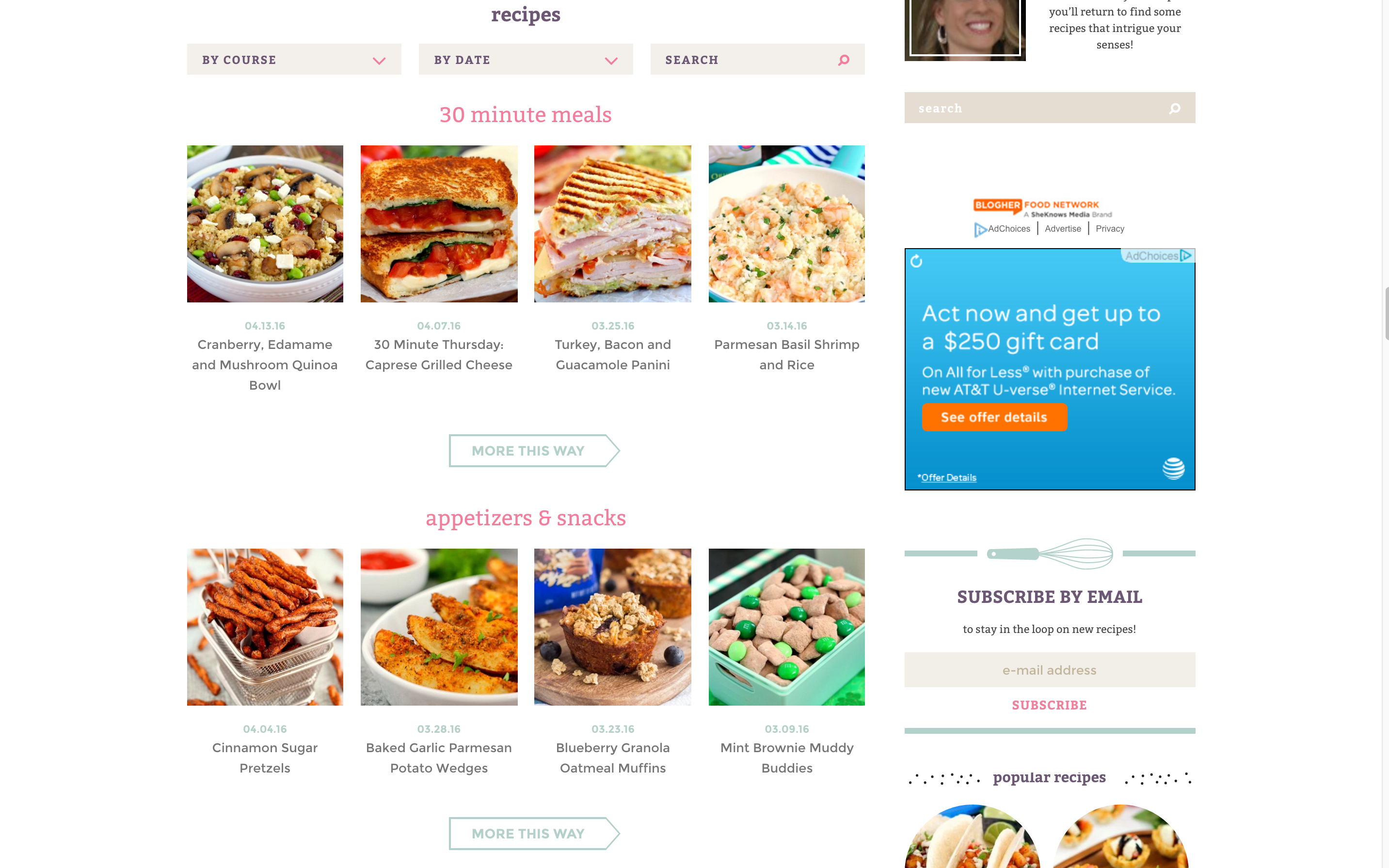
Automated Recipe Index
This recipe index is every blog owner’s dream… once set up, it just works. You don’t have to update it or a plugin! Plus, it uses the existing categories and category pages to display content, so if you decide not to use it any more, your visitors won’t experience broken links.

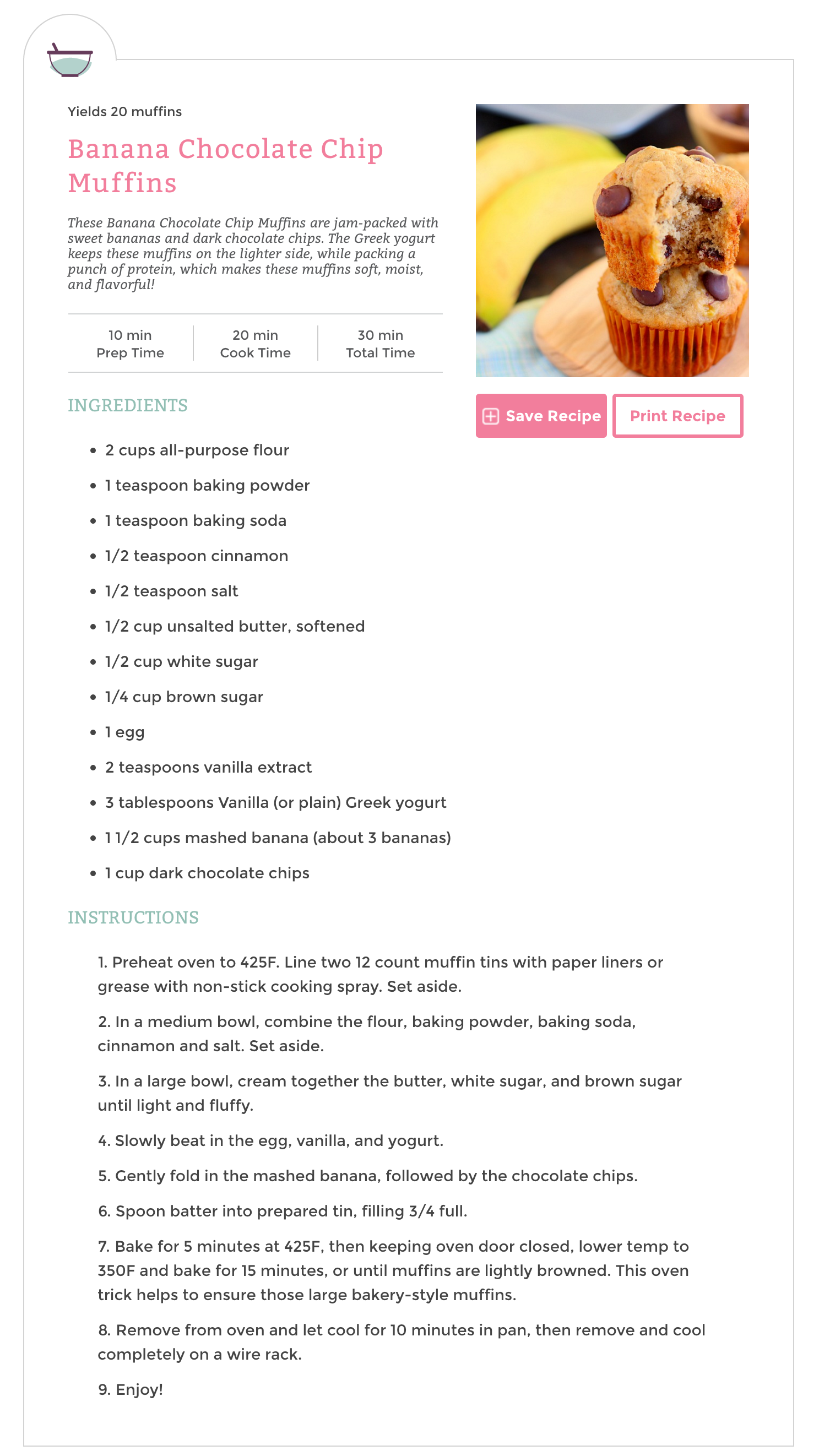
Meal Planner Pro recipe cards
Gayle’s recipes use Meal Planner Pro, with a custom layout. Check out that cute mixing bowl icon! When created using the MPP plugin, recipe cards will automatically output and style the recipe’s information.

Recipe cards for mobile, too!
Notice a trend here? Gayle’s site was made for mobile first, desktop second. Her content is made to look great on mobile first, including her recipes.

Detailed home page
The Pumpkin N Spice blog is detailed from head-to-toe. Notice the highly-customized widgets, as well as the efficient, yet effective, footer area.

Mobile Home Page
Here’s the corresponding mobile layout, which removes the leaderboard ads, tagline, menu icons, sidebar, instragram feed, footer subscribe, and copyright text. Anything that would be ineffectively positioned for a mobile user is removed and added elsewhere within the site.

