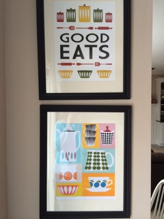
Tanya needed a change of scenery at her site, and wanted it to be inspired by some of her favorite artwork, hanging in her own kitchen! She’s got a lot of content to show off and wanted to be sure that after the redesign, everything would be easy for her to update on her own.
Advertisement Optimized
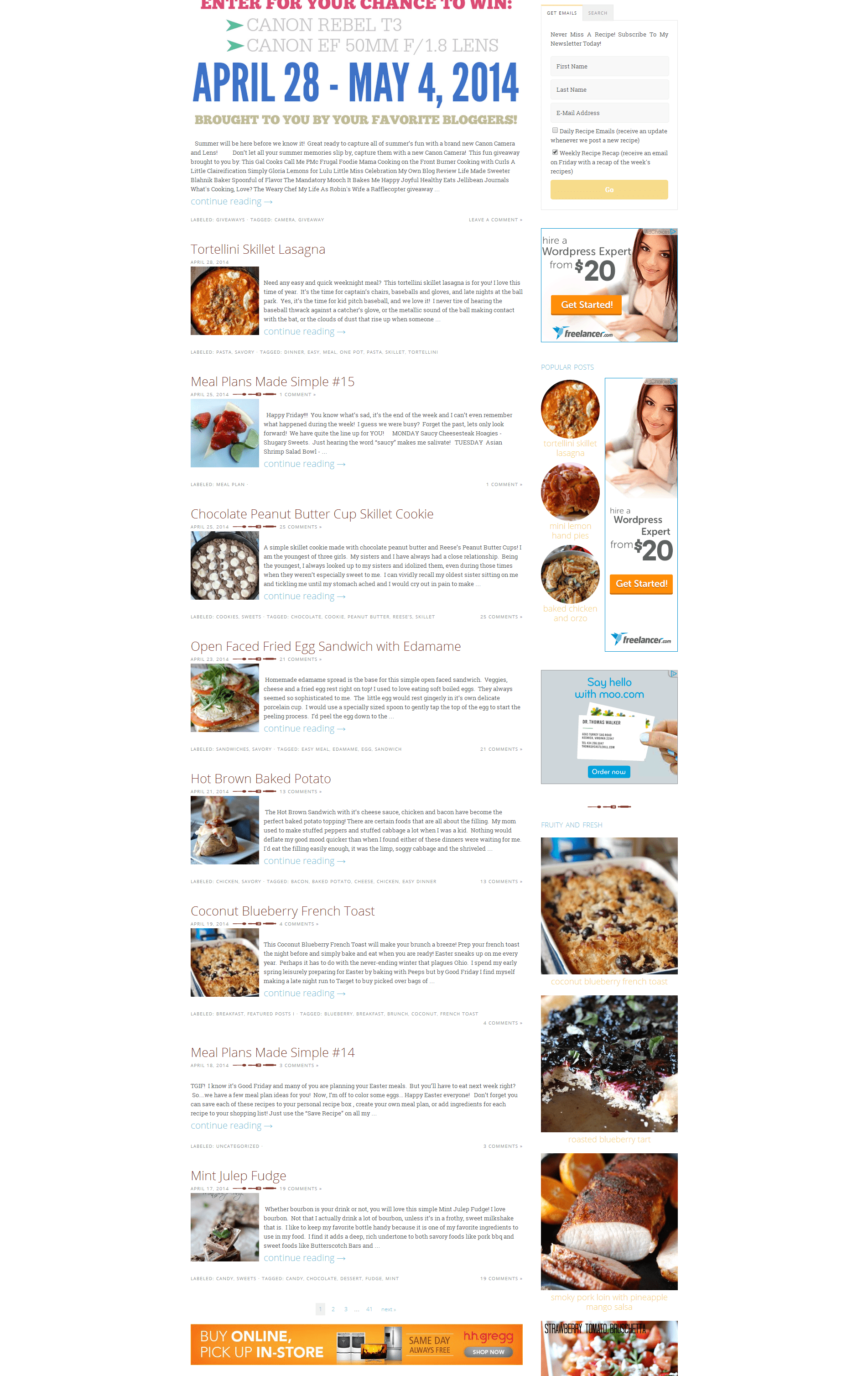
Lemons for Lulu is a popular site, with a lot of companies clamoring for space. By keeping her header small, Tanya knew she could get more content above the fold. Her sidebar is 300px wide to support the common rectangle ad, while her content is 728px to support the ever-important leaderboard ad.
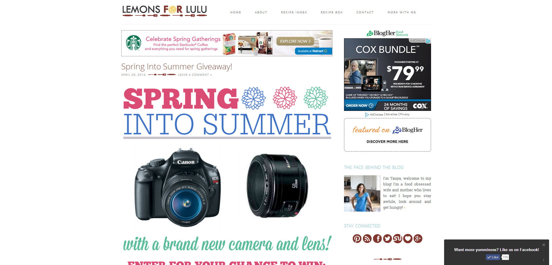
Sidebar Usage
Everything on Tanya’s site is a decision made to maximize what readers would like to see. By styling a free tab widget to look professional, both the newletter sign up and search bar take up the same amount of space. Using side-by-side sidebars allowed advertisement and popular posts to display hand-in-hand. Additionally, a featured post widget allows Tanya to easily update posts highlighted in her sidebar, rather than having to manually link images and photos – now she can just choose a category!
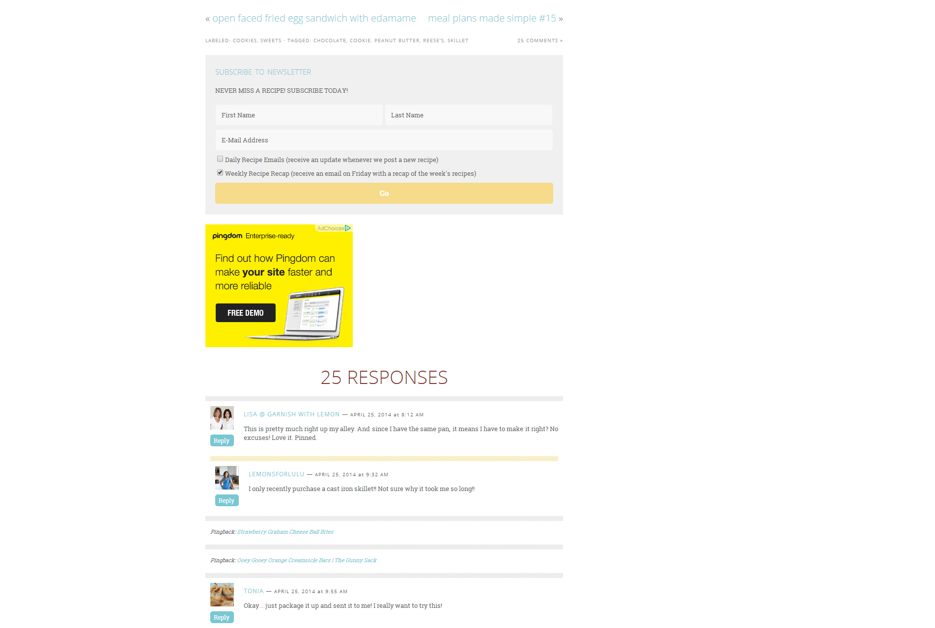
Below Post Call to Action + Comments
Below each post is a newsletter sign up form inviting users to subscribe to receive more great content. This area is also used to display 2 more ads. Below, a custom comment structure was created to integrate comments and trackbacks, display them beautifully, and emphasize which comments are coming directly from Tanya.
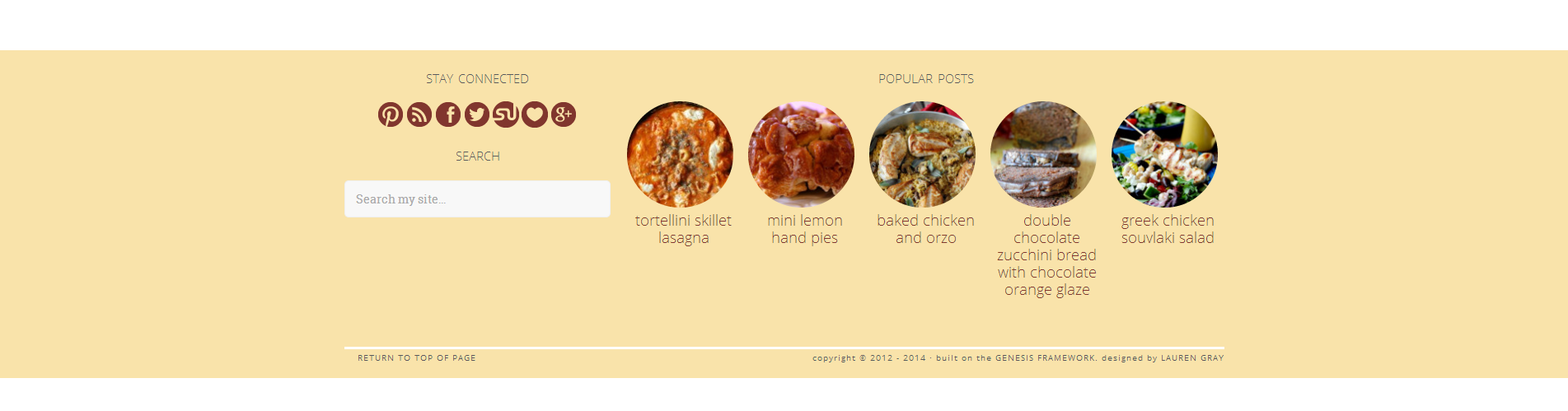
Organized footer to reduce bounce rate
Don’t underestimate the use of a site footer. Removing frivolous information and adding relevant information can say to readers “hey, you finished here? How about reading one of these great articles, or following me on social media?” By creating this aesthetic to complement the design of the site, we draw the reader back in.
Inspiration Artwork
Just as a sneak peek between friends, here’s the artwork that inspired Tanya!