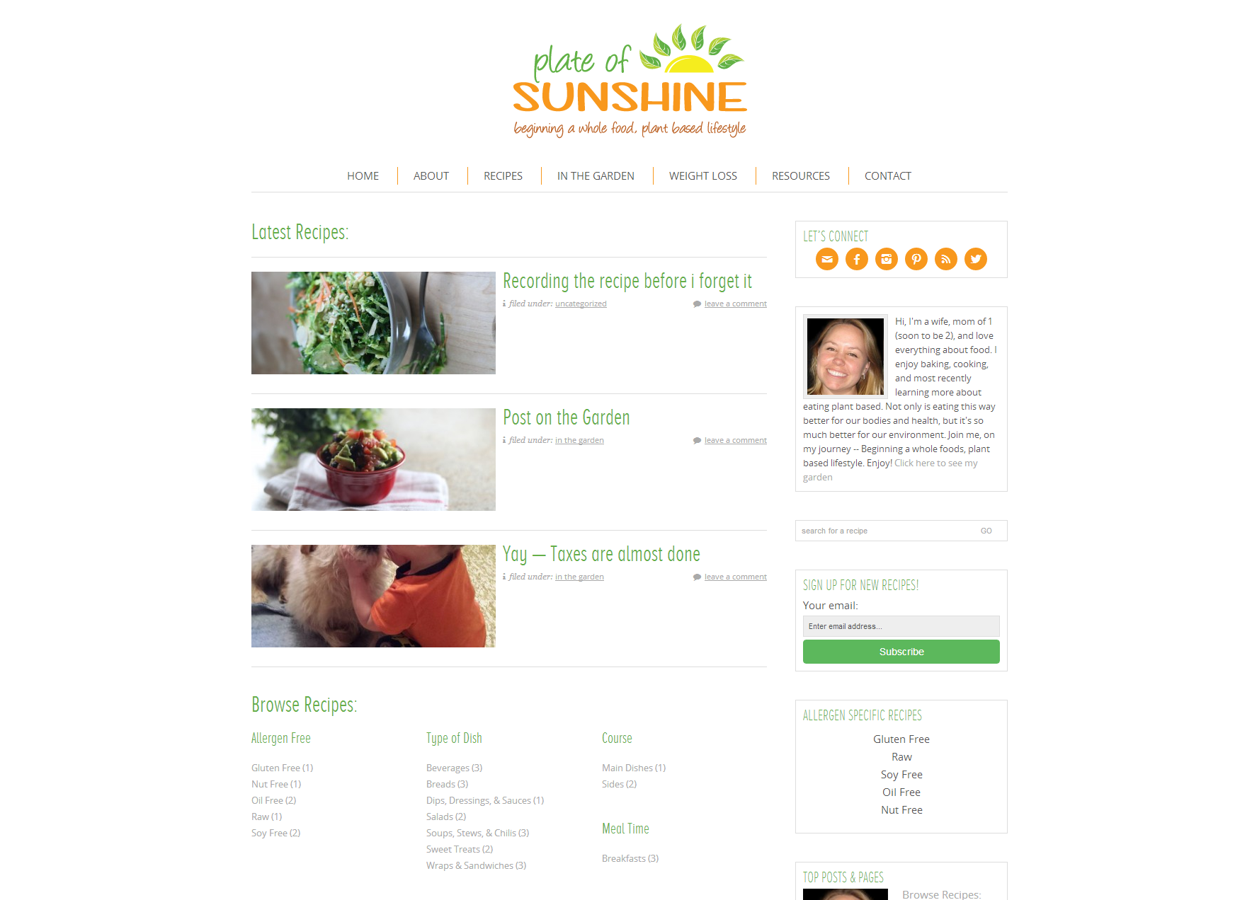
Shannon’s Plate of Sunshine is a place for her to share her delicious recipes and beautiful photos. Knowing that she wanted to get started right, she put a lot of time into researching what she wanted her page to look like and what functionality she wanted it to have. Knowing this allowed us to have a conversation about how to accomplish all of these goals, and the best practices for doing so.
Genesis Grid Loop
Shannon’s home page runs on the Genesis Grid Loop, allowing her to display one post in it’s entirety with the following being excerpts. This allows her regular readers to easily see new content, without making the home page feel cluttered or overwhelming with content for new readers.

Recipe Page Template
Shannon wanted her recipe page to serve as a sort-of index for readers, but also provide a visual element and display her most recent posts. By combining a few different techniques, Shannon has the best of both worlds: her latest recipes appear (with the ability to expand what appears in this page-top area), her categories display automatically (even as she adds new sub-categories), and she’s able to write any additional information she wants at the bottom of the page, such as information about what kinds of recipes she shares, or why!

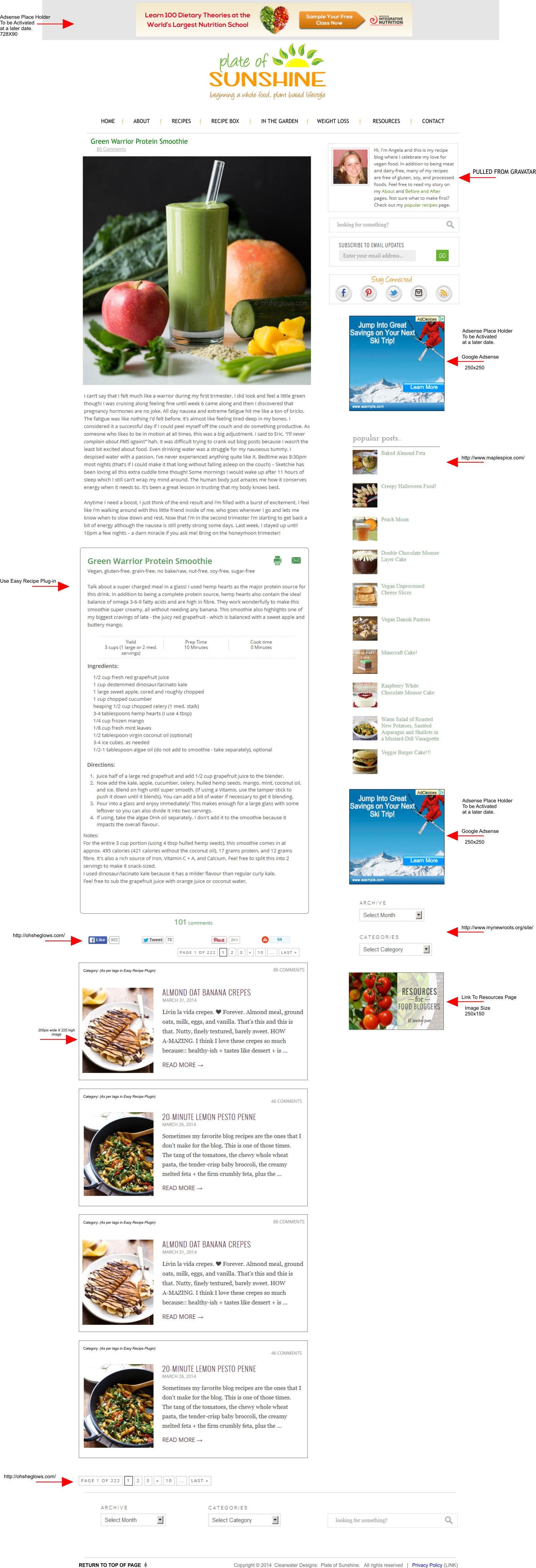
User Supplied Mock Up
One of the great things about working with Shannon was that she knew exactly what she wanted. Usually I ask my clients to tell me what their three favorite sites are, and what they like or dislike about each – that can give me an idea of what their style is and how to mold a design around their opinions. With Shannon, she went to her favorite sites, took screenshots of each, and complied them into one layout. I took this mock up and made it a reality for Shannon.
Visit Shannon at PlateOfSunshine.com

