I bet you wouldn’t guess that Dani’s site is built on the Foodie theme, even as prevalent as it is today. That’s because Dani has done a lot of heavy editing on it, all by herself! In fact, I’m only called in when she’s just tired of trying on a project – she’s got better things to do!
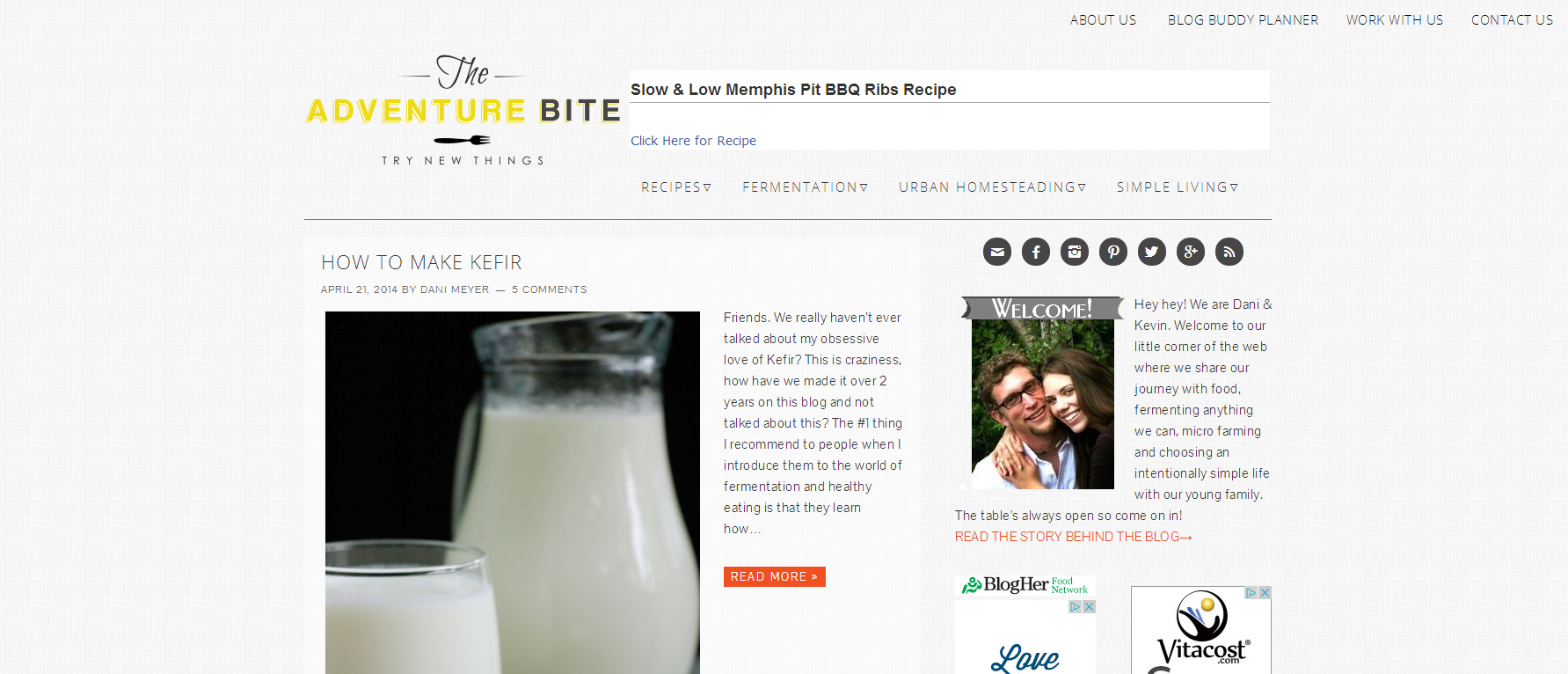
Header Minimization
Dani wanted her site to have a few features that weren’t included in the original theme. Some links at the top right of the page, an ad in the header area, and the navigation below that – but not entirely below the logo itself. Not to mention that everything needed to remain mobile responsive, of course!
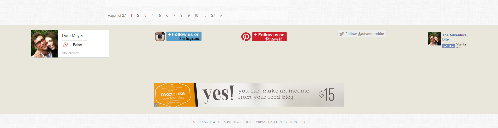
Divided Footer Area
By using the built-in column classes of Dani’s theme, her social networks could be displayed prominently across her footer.
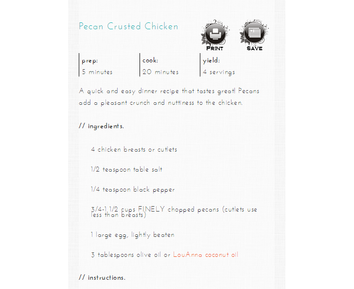
Recipe Styling
Using ZipList for her recipes, Dani took it upon her self to style her recipes. However, once she switched themes she found that something wasn’t working for her anymore. I spent some time troubleshooting to solve this issue, and later moved on to the next step: mobile responsiveness. Her recipe would load fine on a photo, but it wasn’t exactly beautiful, as it should have been. To fix that, some stylistic changes were made (mostly not even noticeable!) including removing the thumbnail image, which was repetitive, too small, and unnecessary in a mobile environment. Desktop:
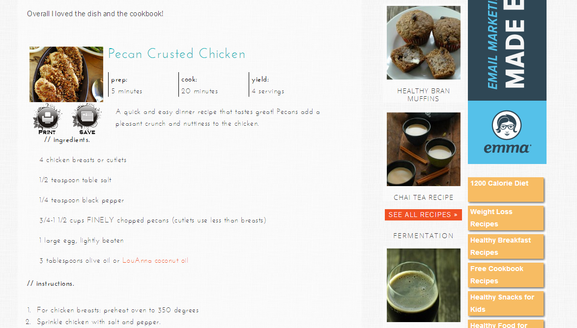
Mobile: